Studio Sidera Work Muzzomo brand and product system
Muzzomo · 2026
A home services brand, in light and dark.
- Client
- Muzzomo
- Year
- 2026
- What we did
- Brand identity and product design system
The brief
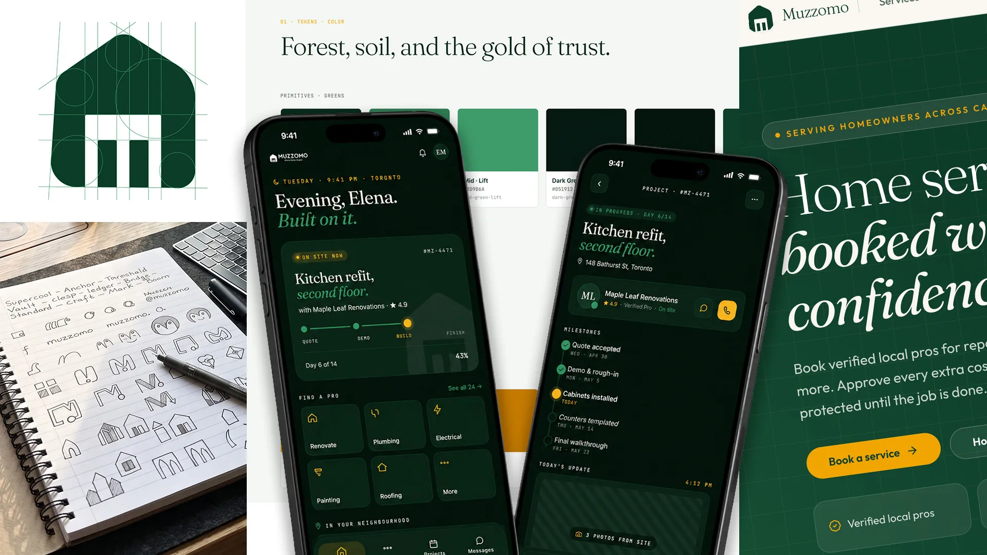
A home services marketplace lives on trust. The brand had to feel as dependable as the trades it represents, serve homeowners, tradespeople and property managers, and work everywhere from an app screen to a van.
- 01
Position first
A market map placed Muzzomo as the trustworthy middle between cheap directories and premium agencies; that position guided every visual decision.
- 02
A complete system
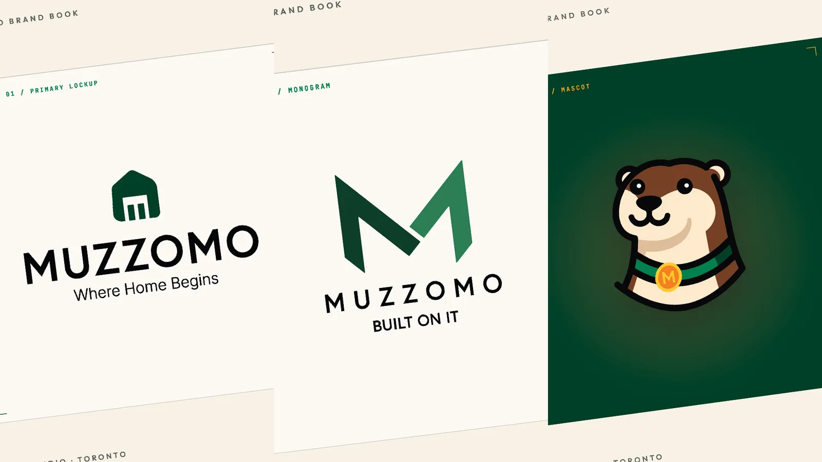
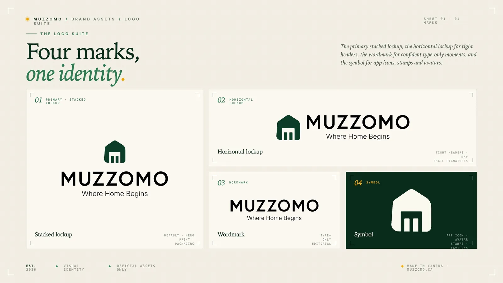
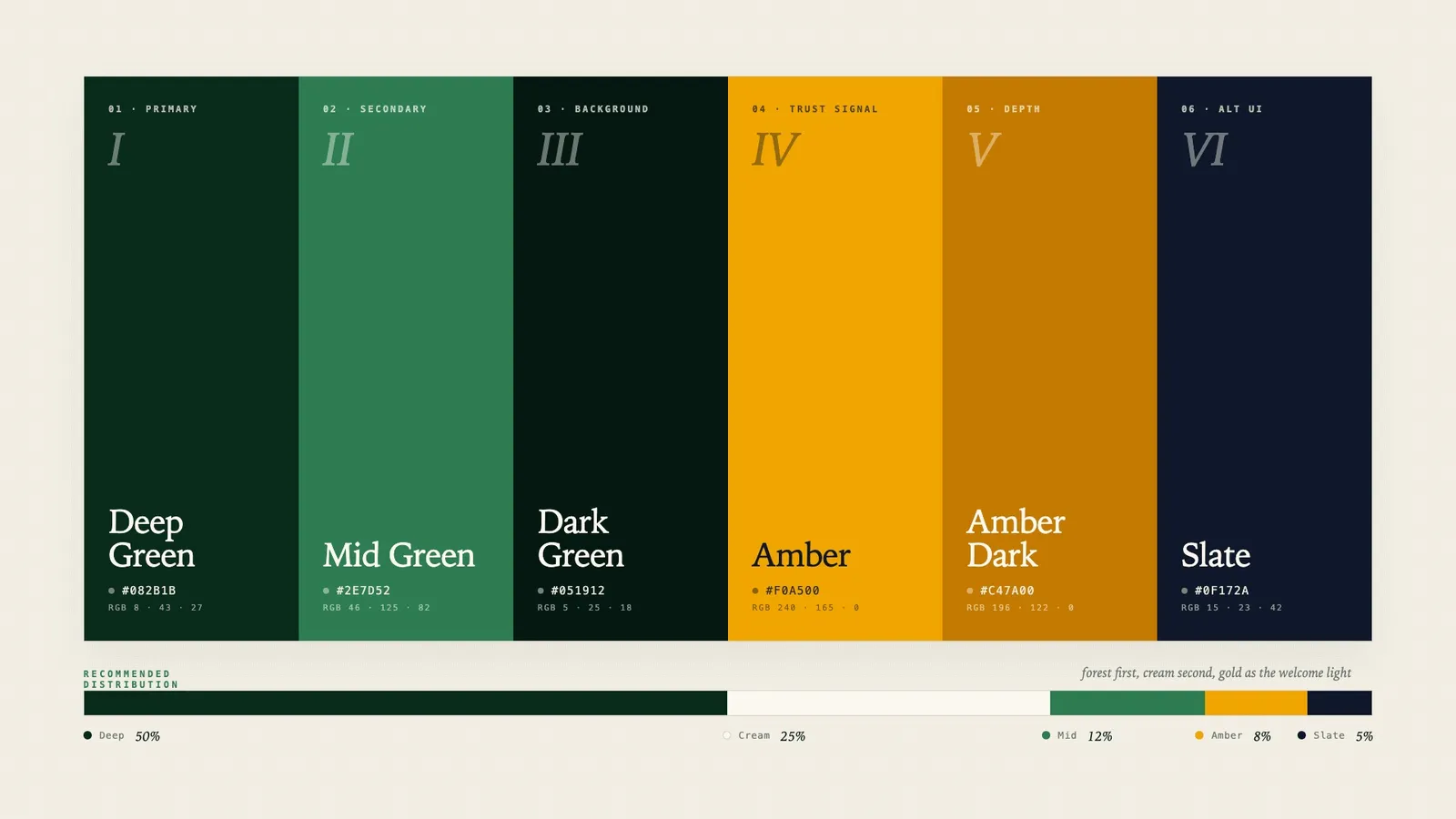
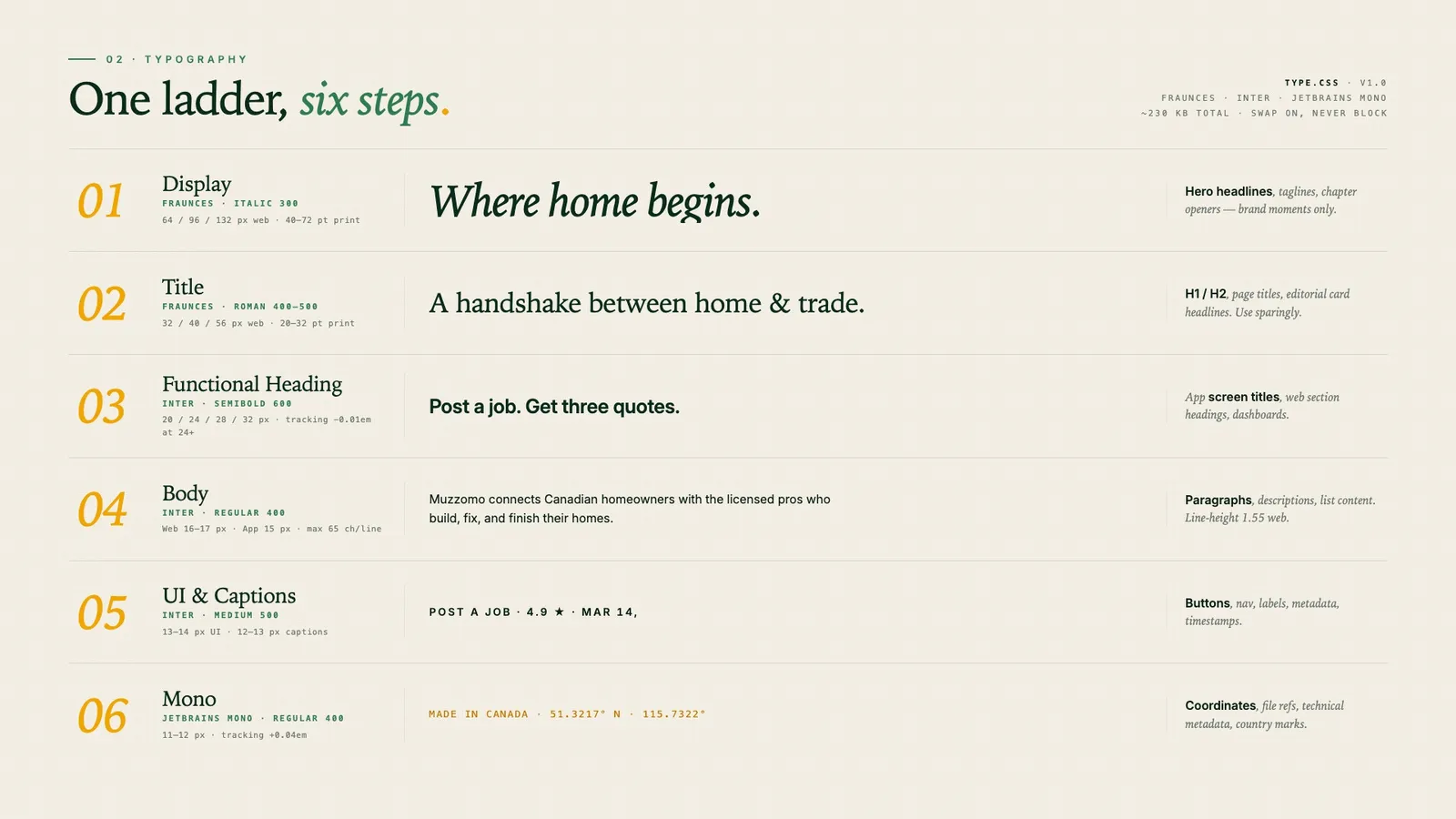
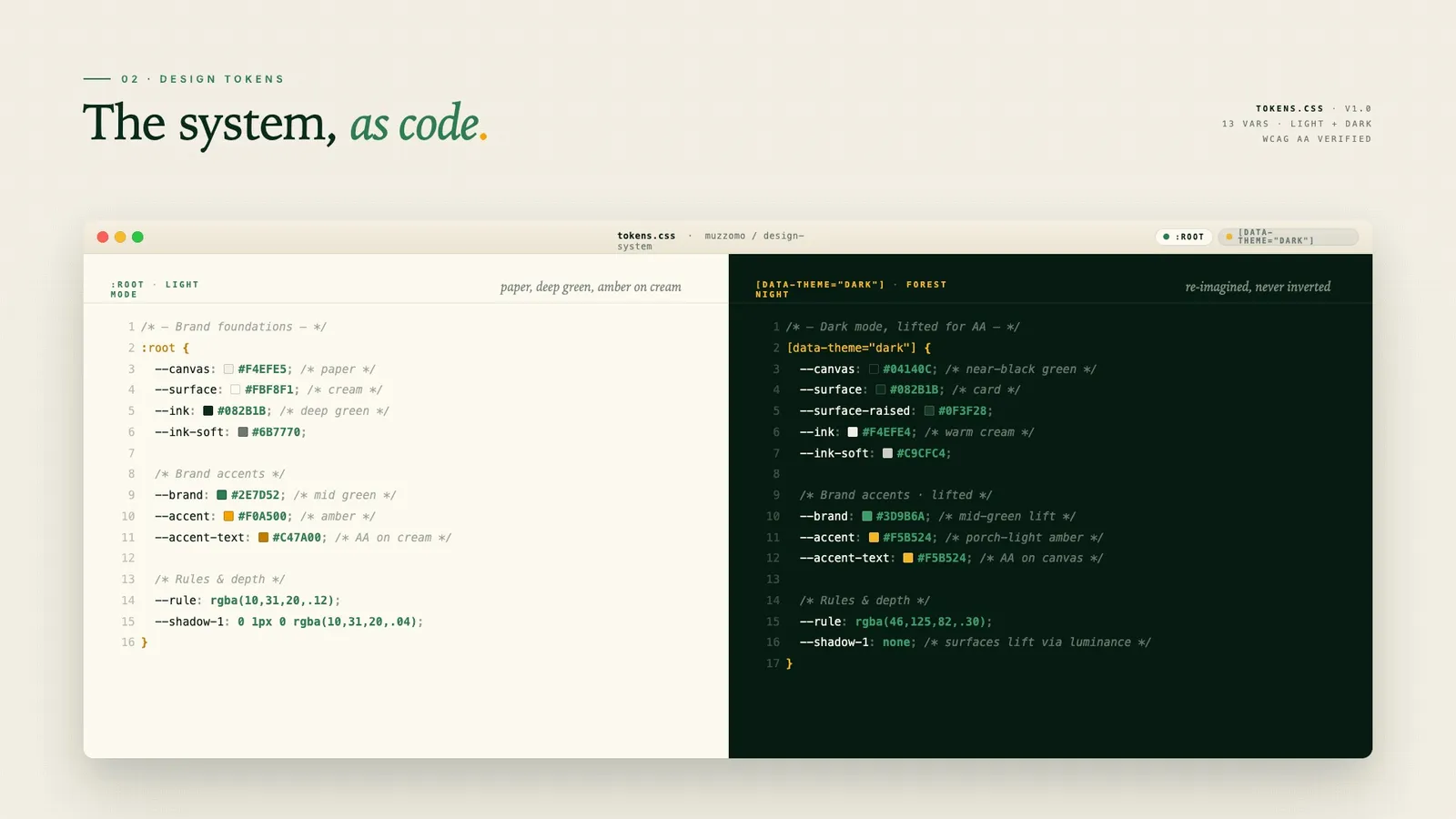
Four lockups, clear-space rules, a six-token colour system and a six-step type ladder, documented in a nineteen-page brand book.
- 03
Dark mode, reimagined
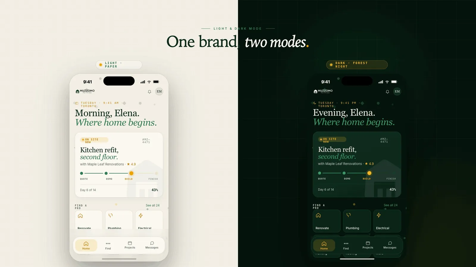
Not an inversion: a parallel surface system where the house mark turns inside out and the brand idea deepens.
0 to 1Brand and productFrom a name and a brief
Light + darkDesigned togetherTwo tokens retired for contrast
WCAG AAVerifiedEvery colour combination checked
Muzzomo is in concept review; results describe the system as delivered.